How To Pick The Perfect Paint Color
Picking a paint color can be very overwhelming, yet rewarding at the same time. As a former Paint Department Manager, I’ve been able to help many customers pick out the perfect paint color, using these tips. However, it is important to trust your instincts as color confidence stems from the colors you gravitate towards.
1. Get a Feel for the Color(s) You Gravitate Towards
It’s important to know if a certain color will go better with your décor, than another. You can find inspiration on sites like Pinterest and Houzz as well as magazines, and paint brand companies websites.
However, many of the colors will look different on a computer or smartphone than they will when you go to the store and pick out a color chip.
This is because the screen resolution and RGB color format are different on screens. For this reason, I recommend only using these sites to narrow down your choices to one or two color families, and not specific color names/numbers because you’ll wind up driving yourself crazy.
2. Look at the Paint Color Swatches at Home
I can’t tell you how many times I hear a customer say, “Wow! This color looks so different on my walls at home than it does in your store”. Go to a paint store and take several color chips and brochures home with you.
Do this before buying a paint sample because you’ll more than likely wind up saving yourself time and money. You can see in the pictures below that the same color looks different depending on the lighting. The left side looks more brown while the right side looks more gray.
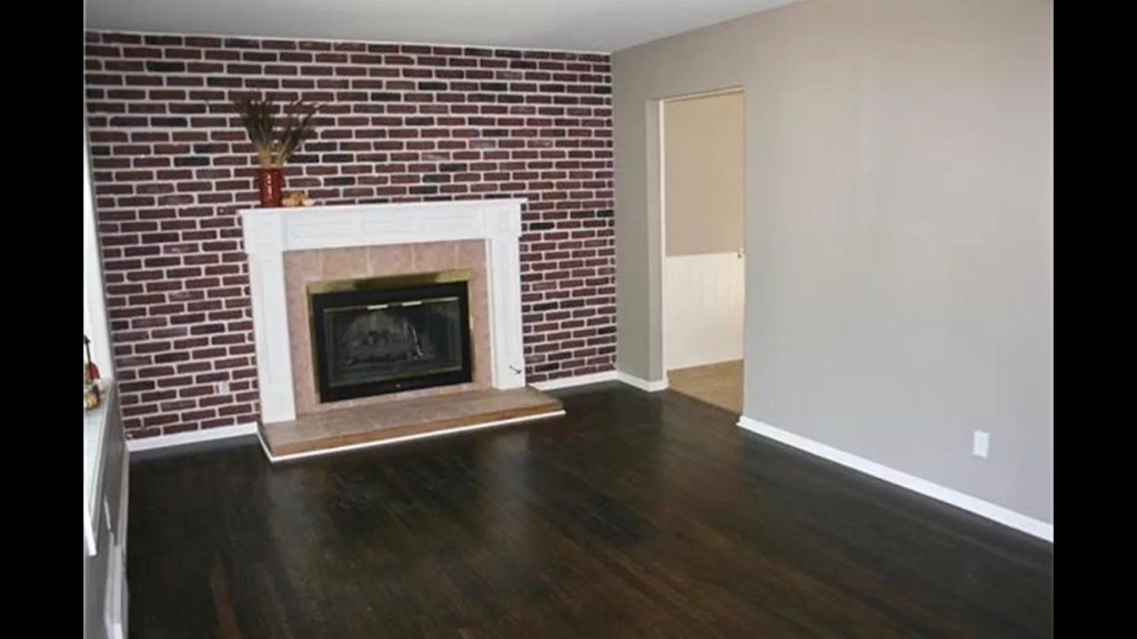
The picture above is a perfect example. The color of the main room with the fireplace is the same color as the room off to the right, but they look like different colors. The main room has a huge bay window, letting in a lot of natural light. Ultimately, the time of day matters greatly when assessing colors.
3. Determine The Underlying Colors
The underlying colors will change in different lighting. I would advise not to ask a paint associate what pigment colors are used to tint a specific color because knowing that information will not help you determine the undertones or help you in any other way. One color can have 20+ formulations.
However, when you look at the color chip in your lighting, you’ll be able to see the underlying colors and you can then decide if that color will work for your area or not.
Sometimes the undertones will be listed on the back of the paint chip. It just depends on the paint company. But ultimately, you’re going to pick a paint that looks best in that specific room/area. Not because it has a certain “undertone”.
I would also highly recommend looking at the color chip or sample board at different times of the day because sunlight and shade can also affect the look of the color, depending on how many sources of natural lighting you have.
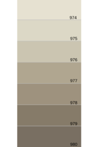
Another way to determine the underlying colors is by looking at the darkest shade on the paint chip card. For example, the paint swatch below shows the same color family. It’s showing you the variation of the color from lightest to darkest.
4. Buy a sample(s).
Buying a sample is a great way to test a color on a bigger surface area, to make sure it’s not too dark or too light. Don’t paint the sample directly onto the wall. It’s better to paint a sample onto a small piece of sheetrock, poster board, or a peel and stick sample so you can move it around and look at it in different lighting. Several paint companies recommend this method, including Benjamin Moore. I like using Samplize!
Samplize offers peel and stick samples. These samples are easy, MESS-FREE, and affordable.
A few reasons that I love Samplize:
- You can order online, and samples are delivered right to your doorstep!
- The samples are much more cost-effective. You won’t have to purchase a paint sample, poster board, AND brushes, that people typically use, for paint samples. you’ll save yourself time/energy and money!
- If you want to try samples in different rooms, don’t peel and stick the sample. That way you can hold it up and move it around.
5. Buy your paint based on the brand name listed on the paint chip you’ve picked out.
(ex. Sherwin Williams, Benjamin Moore, PPG, Valspar etc.)
I always recommend buying the paint brand that’s listed on the back of the color chip you picked. For example, lets say you’ve decided on Benjamin Moore’s ‘Revere Pewter’ color, but you want to use Sherwin William’s paint. There’s a very good chance the color will come out differently.
Don’t be the person that blames the paint store for mixing the wrong color, when in all actuality they most likely mixed exactly what you asked for.
Each paint company owns the rights to their colors and formulas, so Sherwin William’s doesn’t have access to the actual ‘Revere Pewter’ formula. All they have is a color match taken from a spectrophotometer.
In addition, each paint company manufactures their own pigment. This is because they want their paint colors to be mixed with their paint and by manufacturing their own pigment, it makes it much more difficult for another company to match the color exactly.
I’ve mixed so many paint colors in paint brands that are different from the brand listed on the color chip and I will tell you first hand, how much of a difference it can make.
Note- I highly discourage “lightning or darkening” a paint color by any percentage. Unless you don’t plan on having to touch up the walls, it’s really difficult to match a color exactly, once the original formula has been adjusted.
6. Sheen Matters!
Believe it or not, sheen can make a BIG difference. Choose a sheen that will work best in the area you’re painting as it puts a finishing statement on your color of choice. Click here to pin a sheen guide on Pinterest.
- Flat: No shine. Best for hiding surface imperfections. Less durable than other finishes. Best if used in low traffic areas and ceilings.
- Matte: No shine, washable. Similar to flat but has the added benefit of being washable. Choose a Matte finish when you want the flat look but need the added durability.
- Eggshell: Slight shine, washable. One of the most popular and versatile finishes. Eggshell creates a softly polished glow with easy to clean surface. Great for all high traffic areas like living rooms and hallways.
- Satin: Slightly shinier than eggshell, washable. Durable finish that stands up well to repeated cleanings. Great for walls and trim in high traffic areas where you don’t want the full sheen of semi-gloss.
- Semi-Gloss: Slightly shinier than Satin, washable. The smooth reflective sheen is frequently used to highlight interior trim. Semi-Gloss can withstand heat, humidity, and washing, making it a great choice for kitchens and bathrooms. This sheen also works best on furniture, trim, doors, and cabinetry.
- High-Gloss: this finish combines the most sheen with extreme hardness and durability. High Gloss is a great choice for front doors, trim, and other areas you wish to highlight.
Helpful Tools
I hope this complete guide has helped or will help in your search for the perfect color. Leave a comment with the color you’ve chosen and make sure to follow us on Facebook and Pinterest!
Finally, if you’re also needing assistance choosing the right paint, make sure to read my article on A Complete Buyer’s Guide to Types of Paint!


