Farrow and Ball: Railings
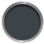
No. 31 / LRV: 6
“Railings” is a paint color offered by Farrow & Ball; a company known for it’s high-quality paints and wallpapers. “Railings” is a deep charcoal and is a softer alternative to black. It’s deep, dark hue is similar to traditional wrought iron railings, which is where this color takes its name from.
Farrow and Ball’s Railings color has an LRV of 8 which is quite low on the scale, indicating that the color reflects very little light. Colors with low LRV values, like deep blacks or near blacks, absorb more light than they reflect. Remember that lighting conditions in a room can also influence how a color’s LRV appear. A color might look darker in a room with limited natural light compared to a room flooded with sunlight.
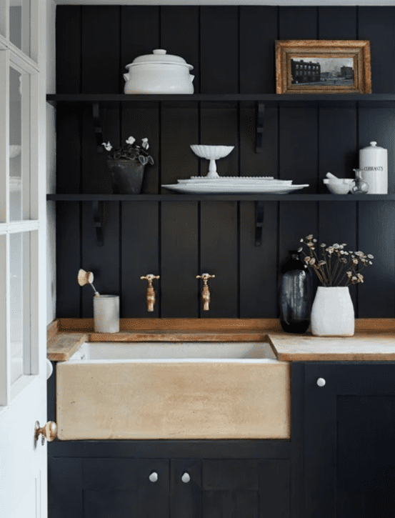
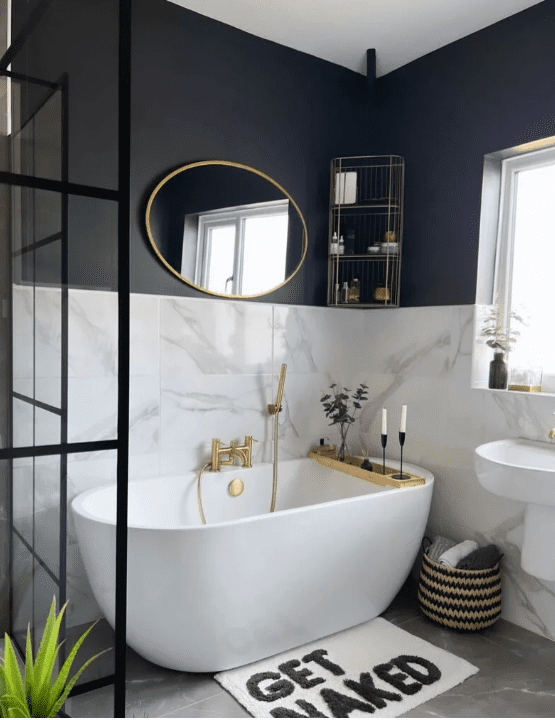
Farrow and Ball Railings Undertones
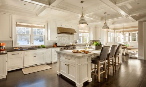
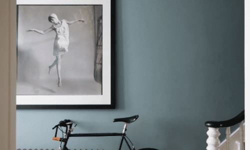
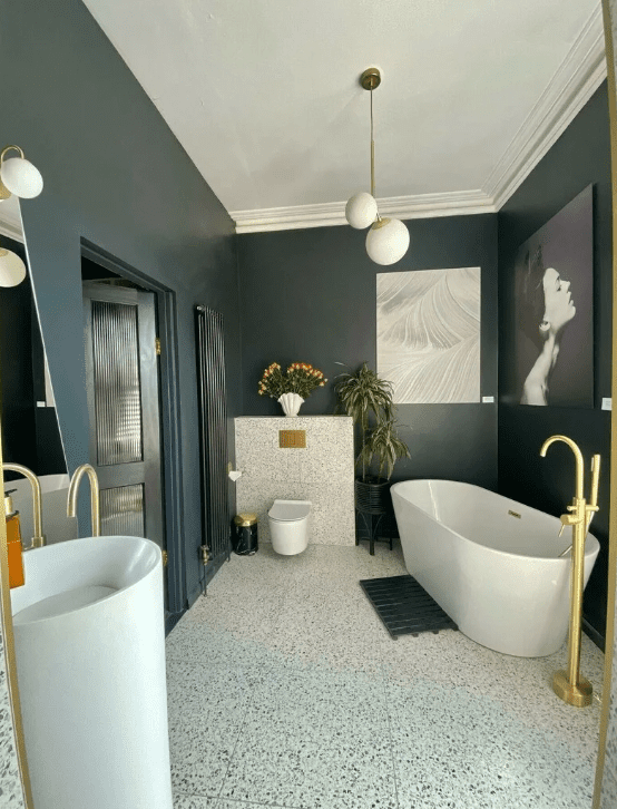
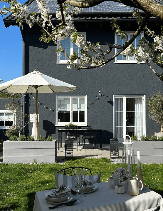
Farrow and Ball’s unique and complex paint colors often have subtle undertones and “Railings” is no exception. What sets “Railings” apart is its complexity. In varying light conditions, subtle undertones surface, casting a reflection that dances between hints of deep blue and profound charcoal. The two pictures below are good examples of what Railings undertones can look like.
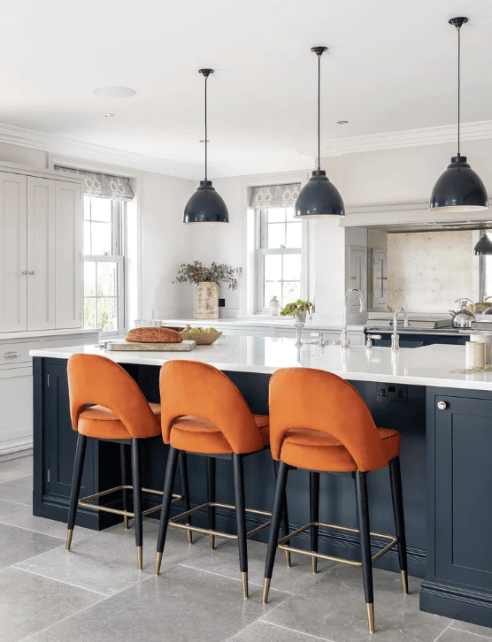
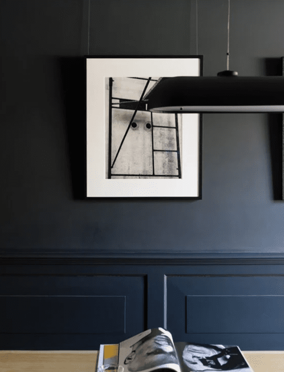
The best way to sample paint colors! SAMPLIZE!
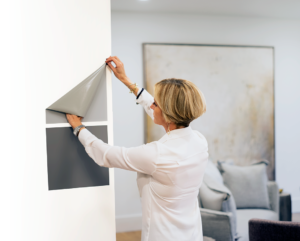
If you’re trying to pick paint colors, you’ll want to sample the color first. Samplize offers peel and stick samples. These samples are easy, MESS-FREE, and affordable.
A few reasons that I love Samplize:
- You can order online, and samples are delivered right to your doorstep in 1 day!
- The samples are much more cost-effective. You won’t have to purchase a paint sample, poster boards, AND brushes. You’ll save yourself time/energy and money!
- No more messy application with wasted paint or leftover paint cans!
- Buy 8 products, get 2 for free!!
Closest paint colors to Farrow and Ball Railings
Colors that pair well with Railings
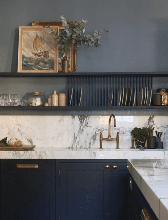
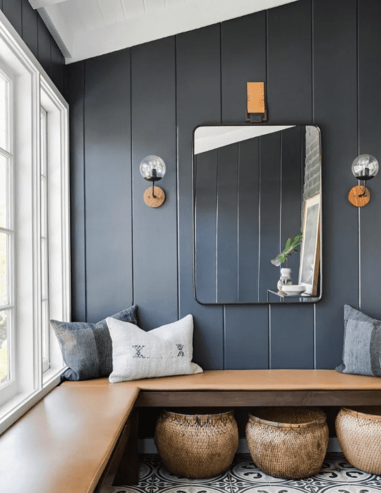
Below, you’ll find colors that pair well with Farrow and Ball Railings. Coordinating paint colors effectively can greatly enhance the visual appeal and atmosphere of a space. When selecting paint colors that work well together, consider the principles of color harmony, contrast, and balance. Ultimately, the best color combinations will reflect your personal style and the ambiance you wish to create in a space.
Color scheme #1:
Color scheme #2:
Sample and Test
Always test your chosen colors in the actual space before committing. Lighting conditions, surrounding elements and the size of the area can influence how colors appear. The easiest way to test colors is using a peel and stick sample from Samplize! That way you can look at the colors throughout the day and see how they interact with changing light. If you want more information on how to choose the right color, make sure to check out my on how to pick the perfect paint color!

